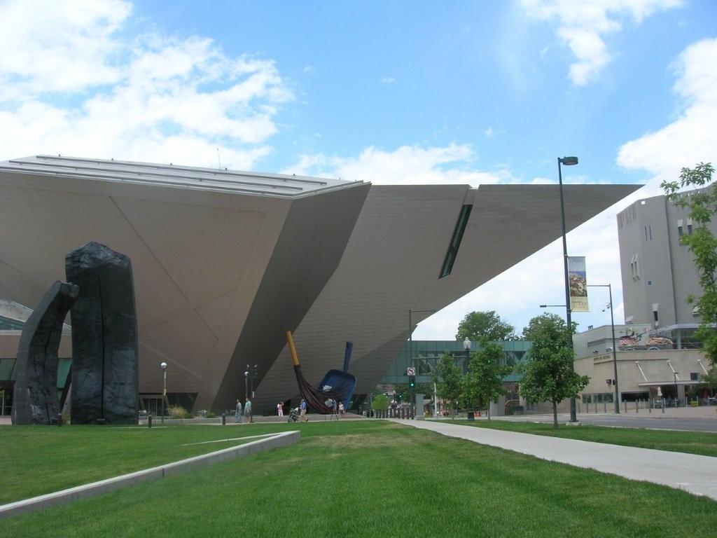
 The Daniel Libeskind-designed addition to the Denver Art Museum, which opened in 2006, doesn’t count as “new†anymore. It seems to have settled into its home near the State Capitol building, dug in, maybe, because it reminds me of an armadillo, bronze-plated and glowing in the sun. It has that peculiar snout, though, a sharp geometric foray into space and toward the original Denver Art Museum building over a busy Denver street. But otherwise it seem perfectly suited to the hot summer day in Colorado on which I visited it – its blocky facets deflecting the heat, its low aerodynamic profile slicing through the hot wind, its situation in the plaza that Libeskind created for it roomy enough to allow its heat to radiate and disperse without warming its neighbors.
So, yes, I approved of the new building from a sculptural point of view — it also reminded me (and my wife — thanks Megan!) of a Stealth bomber. And I like the metaphor: art stealthily and lethally undermining a crude, car-choked American metropolis. But I had two questions in mind for the new DAM: 1) Would the aggressive architecture detract from the art inside, impose itself too much, and 2) how would it “fit” into downtown Denver as an urban design proposition. One visit and a little Googling isn’t going to answer those, but that’s not going to stop me from taking a stab at them… oh no.
Continue reading The Denver Art Museum deflects a hot summer day


