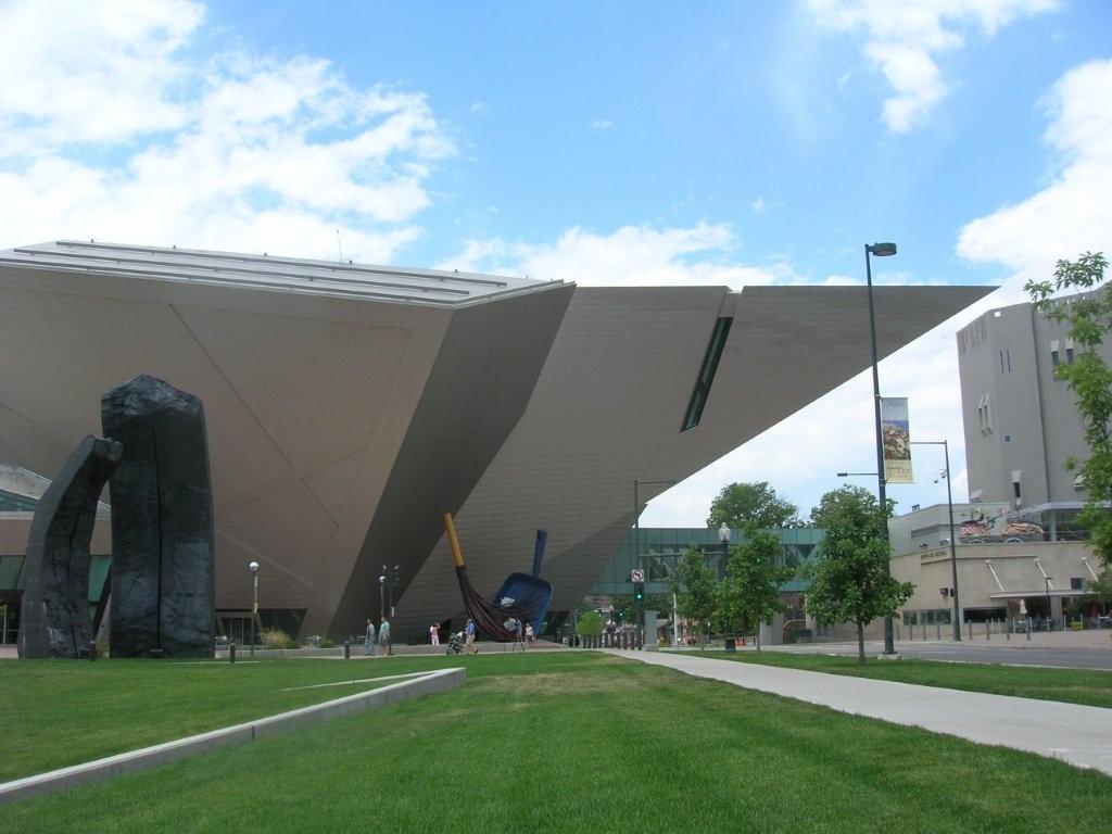
 The Daniel Libeskind-designed addition to the Denver Art Museum, which opened in 2006, doesn’t count as “new†anymore. It seems to have settled into its home near the State Capitol building, dug in, maybe, because it reminds me of an armadillo, bronze-plated and glowing in the sun. It has that peculiar snout, though, a sharp geometric foray into space and toward the original Denver Art Museum building over a busy Denver street. But otherwise it seem perfectly suited to the hot summer day in Colorado on which I visited it – its blocky facets deflecting the heat, its low aerodynamic profile slicing through the hot wind, its situation in the plaza that Libeskind created for it roomy enough to allow its heat to radiate and disperse without warming its neighbors.
So, yes, I approved of the new building from a sculptural point of view — it also reminded me (and my wife — thanks Megan!) of a Stealth bomber. And I like the metaphor: art stealthily and lethally undermining a crude, car-choked American metropolis. But I had two questions in mind for the new DAM: 1) Would the aggressive architecture detract from the art inside, impose itself too much, and 2) how would it “fit” into downtown Denver as an urban design proposition. One visit and a little Googling isn’t going to answer those, but that’s not going to stop me from taking a stab at them… oh no.
The weird angles and facets (not SO weird, really, not Gehry weird, anyway) do present some challenges to the curators. What they suggest, though, is a way to make the experience of the art more intimate: Use the markers of those angles to construct a series of mini-galleries inside. Sometimes that doesn’t work all that well. We suspect that a little Clyfford Still exhibition has been shoe-horned into an impossible space, for example. But sometimes it works brilliantly — an impromptu gallery of small 20th century paintings that might have been lost in the hub-bub of more, well, demonstrative pieces, but in this context leads to deeper reflections about them as individual paintings and the way they connect to art currents in general. Landscapes from the Age of Impressionism had a similar effect — lots of little alcoves to consider the buttery colors of John Singer Sargent, say, or the single sinuous Renoir in the show.
The fourth floor, where the big modern and contemporary works will hang out, was closed for installation when I was there, so my primary concern wasn’t answered — how would those angles work with gigantic paintings so large they are subversive? Or messy sprawling installations? Sculpture? With anything that might “fight back” against the setting Libeskind has designed? I don’t know, but the magnificent towering public spaces in the building suggest an accommodation might be made.
Looking outside the museum — and the eye is drawn back to it, over and over — the plaza that Libeskind has created for his building and the 7-story Gio Ponti-designed North Building (1971) neatly ties the two together and embraces the Denver library (and its Michael Graves post-modern addition), too. With two separate buildings, there’s going to be some confusion at the museum, inevitably. Visitors should remember that the DAM’s excellent Native American collection is still in the North Building. I also noticed that some condos had sprouted nearby. Denver isn’t a walkable city, by any means, but its new close-in developments give it hope, and this cultural district (the performing arts center isn’t too far away and the capitol building is very close) is a good hub for a great urban neighborhood — I would want to live nearby, anyway.
Back to Clyfford Still for a moment, because of the local connection. Not Still himself, though his association with eastern Washington was long enough and close enough to claim some comradeship. It’s amazing how many of the AE heroes had deep Western roots. But Denver will be the home of a new Clyfford Still Museum, scheduled to open in 2010, and its designer is Allied Works and Brad Cloepfil. Those designs are on display in the Libeskind building in the Still exhibition (and by the way, the older Stills remind me of older Carl Morris paintings… which isn’t THAT amazing). At first glance, I thought that maybe the much smaller and plainer Still museum was going to be a casualty of Libeskind’s Big Architectural Gesture, but on reflection I think Cloepfil’s solution to a difficult set of problems is astute — a fairly straightforward rectangle, deftly detailed with textured and resurfaced concrete, and tall enough at two stories for Still’s big drip paintings, but still intimate and somehow “hand made.” It won’t fight the Libeskind, and it will be a a good place to see portions of the 2,400 artworks in Still’s estate after his death in 1980.
Any Scatter readers out there with a different take? I’d love to hear it!