Category Archives: Bob Hicks

BodyVox-2 does the bunny hop

BodyVox-2, in "Usual Suspects." Photo: Blaine Truitt Covert

Mr. and Mrs. Scatter headed for BodyVox, the Portland touring dance and performance company, the other night for the public debut of BodyVox-2, the next generation.

BodyVox is a veteran company, filled with performers who have long and deep experience in ballet companies and with such performance troupes as Pilobolus and Momix. They carry their performances with the sureness and muscle memory of artists who have been living with this material for a long time, and, in many cases, who have had pieces created specifically for them and their bodies.

NodyVox-2, "Hopper's Dinner." Photo: Blaine Truitt CovertSo it’s something of a revelation to see some of these works performed by other bodies. Thursday’s performance included 10 short dances, plus a couple of Mitchell Rose’s terrific short comic films — a smorgasbord of BodyVox hits. Seeing fresh bodies perform them wasn’t just about getting to know a new crop of good dancers in town. It was also about rethinking these works as pieces of choreography that both define the BodyVox style and stand on their own as discrete works of art that have entered the contemporary-dance repertoire.

These are good dancers, all of whom come to the company with significant training and who now get the opportunity to learn the BodyVox style and absorb some of the knowledge of Jamey Hampton, Ashley Roland, Daniel Kirk, Eric Skinner and other main-company stalwarts. BodyVox vet Zachary Carroll directs the second company, which already has done a little regional touring and several school shows, and he’s done a good job: If things aren’t always quite as crisp as with the main company, this is a highly promising, athletic, nimble young professional ensemble.

The troupe of Jeff George, Kara Girod, Melissa Kanavel, Jonathan Krebs and Josh Murry works well together, especially on such ensemble-oriented pieces as Usual Suspects (top photo), the rollicking Hopper’s Dinner, and the nose-wiggling frolic that is The Bunny (inset photo). Despite their loose-as-a-goose moods, these aren’t easy pieces to perform, and BodyVox-2 pulls them off with a nice combination of recklessness and polish.

The growth of BodyVox-2 means a couple of things. First, BodyVox has become an institution, known for a specific style that can be replicated and performed by multiple casts. That’s a big step in the arts-touring game. Second, it’s a bet on the future, a way to prepare for passing things along. BodyVox isn’t just a group of performers who work together any more. It’s a body of work. And BodyVox-2 makes it much more likely that, come that inevitable day when artistic leaders Hampton and Roland and other veterans retire as performers, BodyVox will continue to grow and thrive. You could call this a legacy moment.

BodyVox-2 has two final performances, at 2 and 7:30 p.m. today, at BodyVox Dance Center, 1201 N.W. 17th Ave., Portland.

PHOTOS: Blaine Truitt Covert

Art to enjoy with Chianti, whipped cream and watermelon

One of Art Scatter’s favorite virtual destinations, artdaily.org, is full of all sorts of fun stuff today. For instance, researchers have determined that Tut, the boy king of ancient Egypt, likely died of malaria when he was 19, way back around 1324 B.C. The scientists came to this conclusion after undertaking genetic and radiological testing on the lad’s remains, thus landing a blow to conspiracy theories suggesting murder most foul. (Is there any other kind?)

In other celebrity culture news, Art Daily fills us in on a couple of new visual art exhibitions from artists better known for baking other slices of the cultural pie.

Painting by actor Anthony Hopkins, on view in London and EdinburghThe superb actor Anthony Hopkins is showing a few of his paintings at London’s Gallery 27 through Saturday, then at The Dome in Edinburgh, March 2-6.

Herb Alpert, "BVlack Totems," 2005-09, courtesy Ace Gallery, Beverly HillsAnd trumpeter Herb Albert has a show through May 25 at the Ace Gallery in Beverly Hills of big bronze totems, all in black, and up to 18 feet tall. He’s been doing these for 20 years.
Wayne Thiebaud, "Watermelon Slices," 1961. Oil on canvas. Private collection. Copyright Wayne Thiebaud/License by VAGA, New York, N.Y.Maybe you link Alpert and art with that famous Whipped Cream album cover from 1965. Dessert is more commonly the subject of Wayne Thiebaud, the California artist, who has a new retrospective, Wayne Thiebaud: 70 Years of Painting, on view through July 4 at the San Jose Museum of Art. Best-known for his effervescent donuts and cakes and the like, he branches out to other edibles (and even non-edibles), too, such as this 1961 painting of watermelon slices.

Alpert’s big bronzes are inspired by the great totems of the Tlingit and other nations who live along the north Pacific coast ranging from present-day Washington state to Alaska.

Thiebaud’s retrospective caught my eye partly because of his connection to another California artist, Beth Van Hoesen, whose most complete collection of prints is in the Vivian and Gordon Gilkey Center for Graphic Arts at the Portland Art Museum. Thiebaud was one of a group of important California artists who for many years held weekly drawing sessions at the old San Francisco firehouse that was home and studio to Van Hoesen and her artist husband, Mark Adams. And I’ve lately been working on an essay about Van Hoesen’s art.

I have a small personal interest in Sir Anthony’ art, too. I remember interviewing him back in 1978 or ’79, on the release of his none too fascinating movie Magic, and he was at a low point personally: exhausted, doubting himself, wondering whether it wasn’t time to chuck it all in and try something else. Of course, it was a lull, and the best was yet to come, even if “the best” included, as Hannibal Lecter, playing a fellow who dined on Chianti and human flesh.

“When I paint,” he says of his artwork, “I just paint freely without anxiety regarding outside opinions as criticisms. I do it for sheer pleasure. It’s done wonders for my subconscious – I dream now in colors.”

Including, I imagine, a rich dark red. Cheers!

*

PICTURED, from top:

A landscape painting by actor Anthony Hopkins.

Herb Alpert, “Black Totems,” 2005-09. Courtesy Ace Gallery, Beverly Hills.

Wayne Thiebaud, “Watermelon Slices,” 1961. Oil on canvas. Private Collection. Copyright Wayne Thiebaud/Licensed by VAGA, New York, N.Y.

Mr. Scatter shares the wealth

Mr. Scatter has been a writing fool lately, and not all of it for the virtual pages of this illustrious blog.

Louis Untermeyer, laureate lionine. Wikimedia Commons.He has also composed essays that resulted in actual financial recompense, including a trio of pieces for that fine and noble stalwart of legacy media, The Oregonian.

This piece, about Oregon’s search for a new poet laureate, analyzes the situation and reveals the two most important qualifications: a cool name and cool hair. In the old days it also helped if you could rhyme on a dime, but that is less important in our times of free and cut-rate verse. Mr. Scatter is given to understand that sometimes poems don’t rhyme at all!

Colley Cibber: Bad poetry, great hair. Wikimedia Commons.Mr. Scatter is, in fact, in favor of this position and its title, and he admires Oregon’s retiring laureate, Lawson Fusao Inada, in whose hands the post has been not simply ceremonial but also active and engaged: He has taken poetry and learning to the far corners of the state, in situations ordinary and unusual, and persuasively held that language matters.

Today, by the way, is the final day to nominate someone to be Oregon’s next laureate. Find out how here.

This morning’s Oregonian features this story about the artist Joe Feddersen, whose most recent museum exhibition, Vital Signs, is at the Hallie Ford Museum of Art in Salem.

Joe Feddersen. Photo: Mary RandlettIt’s a fine show, worth the trip. And speaking of trips, Mr. Scatter pauses for what might seem a brief diversion but in fact is not.

Mrs. Scatter ceaselessly admonishes Mr. Scatter that he should join a social network club called Facebook. Mr. PAW goes a step further, proclaiming loudly that Mr. Scatter must Tweet.

In fact, Mr. Scatter has trouble with the 200-odd emails that jam his computer daily, and does not fully understand his so-called “smart” telephone. So please drop in on this reconstruction of the interview portion of How Mr. Scatter Got That Story:
Continue reading Mr. Scatter shares the wealth

Happy Valentine’s Day. It’s an art.

Cy Twombly, Untitled, 2007, from Blooming, A Scattering of Blossoms & Other Things, Acrylic on panel, The Broad Art Foundation, Santa Monica. © Cy Twombly. Courtesy Gagosian Gallery

Ah, the red. Ah, the passion. Ah, the flowers.

Like love itself, Saint Valentine, as it turns out, is something of a mystery. Way back when, in ancient Rome, several martyred saints were named Valentine, or Valentinus. And whichever individual or composite of them emerged to eventually become the Saint Valentine seems always to have been floating in the realm of myth. One early writer, Jacobus de Voragine, refers to the saint in his book Legenda Aurea as a fellow who was beheaded because he wouldn’t deny Christ in front of Emperor Claudius — in the year 280, almost a thousand years before Voragine’s book became a sensation of the High Middle Ages. This Valentine is revered for having restored the sight and hearing to his jailer’s daughter before getting his head lopped off.

Michele Rainier, "Anatomically Exaggerated Sock Monkeys," Beet Gallery, PortlandHow did Valentine become linked with chubby cherubs and love arrows, let alone chocolate and Champagne?

Again, no one’s quite sure, least of all Mr. Scatter, even after long and laborious research of, well, several minutes in an obscure repository of arcane information called Wikipedia. The Nuremberg Chronicle of 1493, referring to possibly the same Valentinus as Voragine, suggests he was beheaded because he’d been caught marrying Christian couples at a time when Claudius II was busy persecuting pretty much any Christian his soldiers ran across. The act of marrying people, of bringing lovers together, might be the seed of the legend. Others suggest that the sentiment of the tradition was pretty much invented by Geoffrey Chaucer and his crowd in the process of mythologizing chivalry and medieval romance, and others yet argue that what Claudius and Chaucer might have begun, those frisky Victorians grabbed by the lacy undergarments and made wholly their own. Exactly when FTD and the nursery industry of America entered the picture is not fully explained.

Xiaoze Xie, Library of Congress (Music Division M1060)  , 2009 oil on canvas 24" x 42" , Elizabeth Leach Gallery, PortlandHow we got here is a puzzle, and yet, here we are, at the Valentine’s Day of modern times, with all of its traditions, temptations and demands. Not, all in all, a bad place to be, unless like a dope you forget all about it and schedule a poker game with the boys instead.

To help you celebrate, we here at Art Scatter World Headquarters are offering a quick virtual tour of some of Portland’s museums and galleries with an eye for artworks that resonate with the holiday. We’ve also thrown in a guest artwork, not available for viewing in the flesh. Details are below.

As our waitron says, Enjoy. And have a lovely day.

Jacopo Bassano, "Saint Valentine Baptizing Saint Lucilla," 1500s. Wikimedia Commons.

ILLUSTRATIONS, from top:

  • Cy Twombly, Untitled, 2007, from Blooming, A Scattering of Blossoms & Other Things, Acrylic on panel, The Broad Art Foundation, Santa Monica. © Cy Twombly. Courtesy Gagosian Gallery. It’s part of a small but significant showing of recent works by the legendary contemporary painter on view through May 16 at the Portland Art Museum.
  • Michele Rainier, “Anatomically Exaggerated Sock Monkeys.” It’s part of a group show, “Erotica — Be My (Naughty) Valentine,” at Beet Gallery, Portland, through Feb. 27.
  • Xiaoze Xie, “Library of Congress (Music Division M1060),” 2009 oil on canvas 24″ x 42″. This passion of the book is part of the group show “Re-Present,” at Elizabeth Leach Gallery, Portland, through March 27.
  • Jacopo Bassano, “Saint Valentine Baptizing Saint Lucilla,” 1500s. Wikimedia Commons. Note the chubby winged babes bestowing their approval. This one’s not in Portland, folks.

Gentlemen, do the right thing

Nurys Herrera and Vicente Guzmán-Orozco; photo by Russell Young

Tomorrow is St. Valentine’s Day. This is an important occasion, and not one to be taken lightly — or, horror of horrors, forgotten — unless you enjoy being a thirty-five-year-old bachelor living in your parents’ basement and spending all your free time playing online Dungeons & Dragons.

Pancho Villa did not waste his time like that. Pancho Villa did not spend his Valentine’s nights alone. Pancho Villa was a man, and he knew how to treat his significant other of the moment.

This may or may not be at the heart of Sabina Berman’s comedy Entre Villa y una Mujer Desnud (Between Pancho Villa and a Naked Woman), which opened last night at Milagro Theatre. The play’s performed in Spanish, with English subtitles, and although we haven’t seen it yet, as Milagro describes it, it sounds fetching:

Gina wants more out of her casual relationship with Adrian, a liberal intellectual who’s in it only for some good sex. Adrian shies away from any form of commitment – that is, until Gina takes up with a younger, more sensitive lover. That’s when the spirit of Mexico’s most famous revolutionary rides again, appearing as Adrian’s macho conscience ready to do anything to win this battle of the sexes.

This evening Mr. and Mrs. Scatter will hie themselves out to Hillsboro for the opening of Bag & Baggage Theatre‘s own contribution to the battle of the sexes: a scrunching-together of Shakespeare’s comedy The Taming of the Shrew and John Fletcher‘s Jacobean response to it, The Woman’s Prize, or The Tamer Tamed, in which Kate comes out on top. Do tell!

We might have gone to Third Rail Rep‘s new revival of David Mamet‘s American Buffalo, which looks like it could be a memorable production, but not this weekend. It’s about three loser guys trying to pull off a scam from a junk shop. What’s the percentage in that? If they couldn’t score a date, they should have just settled in for a round of Dungeons & Dragons.

Don’t let that happen to you, D&D boys. A last-minute tip: Flowers are always good. Chocolates, too. At Chez Scatter, we’re planning oysters and sparkling wine. We might be leaving our bandolier and hat on the hitching post, though.

*

PICTURED: Nurys Herrera and Vicente Guzmán-Orozco in “Entre Villa y una Mujer Desnud.” Photo by Russell Young.

A Snopes by any other name

My paternal grandmother’s name was Lizzie Lou Willingham. Not Elizabeth Louise. Lizzie Lou.

Lizzie Lou married Virgil Homer Hicks, a man whose naming signaled a certain familial aspiration. One of their offspring, my father, is named Irby Hicks. No middle name, and a first name that was a family surname. (Another of their children, my father’s sister, was named Zollie.)

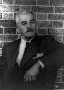
William Faulkner in 1954. Photo: Carl Van Vechten. Wikimedia CommonsThe Willinghams and Irbys and Hickses came from South Carolina and Georgia, places where a naming was a serious and sometimes flowery business. On Long Island and in the Hudson River Valley, where my mother’s side of the family had their roots, the names were historical and solid — Baldwin, Seaman — but without that peculiarly Southern sense that a naming is an almost mystical occasion, an assigning of an intensely personal yet communally meaningful identification for life. My mother’s maiden name is Charlotte Lucille Baldwin, and it’s lovely. But it seems somehow less thethered, less essential to her personality or her family’s historical lot in life.

I bring this up because of Patricia Cohen’s report in the Thursday New York Times on the fresh linking of an old farm ledger to many of the names that William Faulkner used in his novels, and in 1942’s Go Down, Moses in particular. The ledger was kept in the mid-1800s by Francis Terry Leak, a Mississippi plantation owner whose great-grandson was a childhood and adult friend of Faulkner.

In it were the names of many of the plantation’s slaves, and the reading of them both angered Faulkner and excited his imagination. Cohen describes Edgar Wiggin Francisco III, the son of Faulkner’s friend, watching the great writer as he was going through the pages of the diary and “hearing Faulkner rant as he read Leak’s pro-slavery and pro-Confederacy views”:

Faulkner became very angry. He would curse the man and take notes and curse the man and take more notes.

That’s a potent vignette, and it speaks to why Faulkner still matters very much. He used many of the slave names from the journal and assigned them to white characters in his books, as he had taken a Native American name and given it to his famous fictional stomping grounds, Yoknapatawpha County. These were not, I think, so much acts of expiation or appropriation as of remembrance, and of the novelist’s determination to describe not only who “won” the battle for the South’s soul, but also the sins and brutalities that went into the waging of a confrontation in which all races and classes were engaged, and from which a great sadness fell not equally yet fully across the land. Don’t forget, Faulkner told his readers. Don’t mythologize, don’t blame others, and never forget.

That is starkly different from the attitude of another Southern writer, H.L. Mencken of Baltimore, who in his fascinating if sometimes fiercely outdated collection The American Language took many race-baiting cheap shots at the names that African American parents gave their children, citing them as examples of black Americans’ lack of education and common sense. (He seems utterly to have missed the playfulness, the sense of separate cultural identification, and the poetry in many of those names.) And that is evidence of why Mencken, once a household name, matters less and less.

Other writers have made great use of character naming, from Shakespeare’s Sir Toby Belch to Sheridan’s Mrs. Malaprop to Dickens’ Thomas Gradgrind. But Faulkner created one of my all-time favorite character names: Flem Snopes.

Flem was the anti-hero of three novels, The Hamlet, The Town, and The Mansion, that traced the rising tide of the Snopes family fortunes from horse thieves and tenant farmers to Flem’s establishment as president of the town bank and occupant of its grandest house.

Flem accomplished this by having a soul the size and consistency of something stuck in your throat: He was, in his essence, Phlegm. A cheater, a calculator, a man small and hard and avaricious. A man who married a young woman pregnant by another man because she came from a family that would be useful in his rise to the top. A man you’d like to just spit out and forget, except he sticks there, and sticks there, and sticks there, and so you can’t.

Flem Snopes. Now, there’s a name. Would a Snopes by any other name be so sour?

Singing for Haiti: a Portland benefit

Seems like every time something cataclysmic happens, artists show up to help out. Like a lot of other people they know they can’t do much, but they also know they can do something. And often, because this is what they do best, they put on a show.

A painting by Leslie Ann Butler will be used as cover art for the benefit CD "Portland Sings for Haiti."Especially when you’re talking about the local artists who are the heart and soul of any city’s arts scene, that often means that people who barely have two dimes to rub together are among the ones who jump in and get something done. They raise awareness (pardon Mr. Scatter for employing that overused phrase) and they raise money. I’m not sure why performing artists and restaurant people so often take the lead on this sort of thing, but maybe it’s because both work in businesses where they become acutely aware that nothing gets done right unless everyone works together.
The Oregonian’s Marty Hughley has announced one such benefit project, a benefit CD called Portland Sings for Haiti. Marty’s story is interesting, especially in relating how actor Patty Price-Yates got the thing rolling from her own sickbed, so click on the link. The CD, which features cuts by such leading lights as Storm Large, Susannah Mars, Julianne Johnson and Isaac Lamb, will be available Feb. 22, and you can pre-order at cd baby. The money will go to Mercy Corps for its efforts to help Haiti dig out from the rubble of its massive earthquakes.

Singer-actor Corey Brunish, a participant and one of the project’s organizers, reminds me that you can get a sneak peek (or an early ear) at the music starting at 7 tomorrow night, Thursday the 11th, at Wilf’s. Several of the CD’s musicians will be on hand for a cabaret-style show, and it’s a two-fer benefit. Proceeds from the $20 admission will benefit the musical-theater company Stumptown Stages. Plus, you can be one of the first people to buy the CD, and that money goes to Mercy Corps.

Sounds like a good night out.

*

ILLUSTRATION: This painting by Leslie Ann Butler is cover art for the benefit CD “Portland Sings for Haiti.”

My fellow Scatterers: the state of the blog

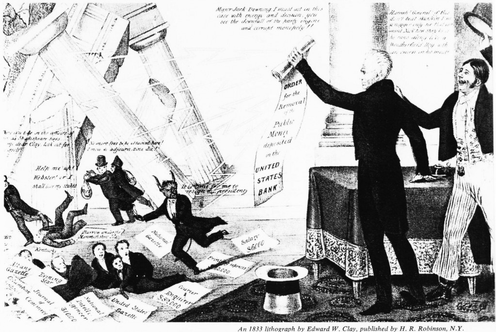
English: Lithograph by Edward W. Clay. Praises Andrew Jackson for his destroying the Second Bank of the United States with his "Removal Notice" (removal of federal deposits). Nicolas Biddle portrayed as The Devil, along with several speculators and hirelings, flee as the bank collapses while Jackson's supporters cheer.

On this very day two years ago — on February 8, 2008 — a fine strapping lad was loosed upon the world, and immediately started yawping. Yes, its name was Art Scatter, and it was born right here in river city: in Puddletown, Oregon, brave bubble of liberality, Do It Yourself center of the universe, fearless exposer of itself to art, curious keeper of the weird.

Call us sentimental, but we’ve been thinking a lot about our friend Art, this thing we call a blog. For one thing, why is it still here?

A lot of blogs burn bright for a while and then flame out. Many are simply places to vent steam, or casual public diaries, or vanity projects. Well, almost all, including this one, are the latter at least to a certain degree. After all, nobody’s making any money out of this thing.

English: Father Time and Baby New Year from Frolic & Fun, 1897Art Scatter has changed a lot over its two years. It was the brainchild of Barry Johnson, my friend and longtime arts section compatriot at The Oregonian, who was looking for a way to explore new approaches to journalism outside of the print world. Barry brought me and his friend Vernon Peterson, a lawyer and talented literary critic, into the project, which was planned to be not too taxing on anyone because there would be three people to fill the virtual space.

Life moved on, and both Barry and Vernon departed for other projects. That left me wondering what to do with the thing, and wondering, sometimes, whether I was letting it eat up far too much of my time. In a very real sense my wife, Laura Grimes, saved the blog when she began to post her own witty and moving observations, eventually under the nom de plume of Mrs. Scatter. How could I not keep Art Scatter going? I was fascinated by how Mrs. Scatter’s adventures were going to turn out. Besides, she injected a bracing shot of humor into the blog, the humor that I have known and loved for more than twenty years.

Martha Ullman West, the noted dance critic who had written a couple of pieces for us, began to contribute more, and that added to the conversation. But I realized that if the thing was going to keep going, it was going to be largely up to me.

So. Why was I doing this?

  • First, writing’s a habit. I do it reflexively, if not always reflectively. Just can’t seem to help myself.
  • Second, it’s fun.
  • Third, it allows me scope to write about a lot of things in a lot of ways that were rarely possible during my years in daily journalism.
  • Fourth, it keeps me connected to my community and allows me to have a voice in a few things that go on in this little corner of the world. Good lord, I’ve made friends through this thing!
  • Fifth, it helps me discover my post-newspaper writing voice. I can feel that voice waking up inside me, gradually realizing that it’s no longer bound by the newspaper straitjacket unless it chooses to be. I can hear it trying out new things, even whooping it up now and again. Good for you, voice. Let ‘er rip.

Slowly, mostly accidentally, the blog has developed its own personality. The characters of Mr. and Mrs. Scatter just sort of announced themselves. The Large Smelly Boys pushed their way into the mix. OED, the Older Educated Daughter, made brief visits. We talked about word games and secret societies and oysters on the half-shell. The League of Tough-Guy Arts Observers had its brief day in the sunshine and then wandered off to sleep in a cave: perhaps it’ll wake up and elbow back into the action again. We found we were able to be serious, and flip, and amused, and reflective, and serious and amused again, and somehow get away with it. We began to take a very broad view of just what the word “culture” means.

I’m sure Art Scatter will continue to evolve. It’s already changed in surprising and often delightful ways. It’s opened doors. I know people will drop in and out. Mrs. Scatter’s day job has been busy lately, and I’ve been missing her brilliant reports. (I’m sure you have, too.) Can’t wait for them to return.

And I’ve become convinced of one thing: The blog has to work with my writing career, not against it. I love the freedom and scope that Art Scatter gives me, and I love that it lets me try things out with a regular and forgiving readership. But I also need to make a living, and I do that by writing. This is not a hobby. It’s what I do. So if Art Scatter is my professional exploratory laboratory (and also the locus of a great deal of my pro bono work) I want it to look professional.

Which brings us to Modern, the new design theme that we’ve adopted, yes, today. And which wraps up this semi-impromptu State of the Blog address. Thank you, my fellow Scatterers. Good night, and God bless.

*

Illustrations, from top:

  • Not Mr. Scatter delivering his State of the Blog address. Edward W. Clay’s lithograph celebrates President Andrew Jackson’s destruction of the Second Bank of the United States with his “Removal Notice” (removal of federal deposits). Well done, Andy! Wikimedia Commons.
  • Not Baby Art Scatter. Father Time and Baby New Year from Frolic & Fun, 1897. Wikimedia Commons.

Art Scatter’s new look: We have a winner

As you may have noticed, here at Art Scatter we’ve been stressing out lately about the way we look. We were feeling – frumpy. We wanted something fresh, something new, and came up with three possible visual themes to replace Artsemerging, the theme we’ve been using since the blog began two years ago.

Wikimedia CommonsWe asked for your advice, and a lot of you gave it. Thanks to Scatter friends and followers Charles Deemer, LaValle Linn, Charles Noble, Brett Campbell, Cynthia Kirk, Mighty Toy Cannon and others for chipping in with preferences and ideas. Each of the three candidates had its fans, and each had its detractors. I appreciate the energy that all of you put into this. And I appreciate that more than one of you noted that design isn’t why you visit Art Scatter, anyway: You come for the writing and the ideas. Special thanks to LaValle for her warning that Web designs can devour your time and sanity in the middle of the night if you let yourself get too deeply drawn into them: Perish that thought!
Still, we want the writing and ideas to be displayed well. The decision wasn’t easy. At least one of you listed the eventual choice as his least favorite.

And the winner is – Modern, designed by Ulf Pettersson, the design you’re looking at now.

It’s a clean, well-spaced, elegant design, a very professional-looking presentation, and that’s important. Its headlines are understated but big enough to stand out, and they look good running either one or two lines. Its serif type style moves serenely among bold, italic and roman type, making its point at each stop without leaping for your jugular. The type’s a little small in its pull quotes, but they still look good. The design handles splendidly such small but crucial matters as spacing and creating ample windows for inset illustrations: Nothing’s haphazard about it.

Is it too understated? We’ll see. If it turns out to be, we’ll switch again. Charles Noble touts the advantages of the premium design he chose for his blog Noble Viola, and it’s true that paying a little more can add a great deal more flexibility. I like the way that Charles’s blog can highlight several posts at once, for instance, and the way it can add “extras” such as promotional highlights and recent comments and still look crisp and inviting.

I’ve spent a lot of time inside these three designs, checking them out not just for looks but also for flexibility. When we began this journey I was drawn to the jazzy, stop-the-presses look of Copyblogger. (Mighty Toy Cannon points out its nice retro feel and homage to “legacy media,” meaning newspapers, the world from which both Mr. and Mrs. Scatter emerged). But although I liked its side panel perhaps the best of the lot, it had internal difficulties that made it hard to choose, including, but not limited to, poor spacing for its illustration windows, allowing type to bump right into the pictures.

In general I prefer serif types to sans serif types, although a good sans serif beats a bad serif. Veryplaintext 3.0 has my favorite typeface of any candidate, a distinctive and gorgeously assertive face. But it doesn’t like italic very much (what you see isn’t always what you get), and I consider italic type an integral tool in my presentational box. The real deal-buster, though, was its ragged, center-adjusted side panel, which to my eye (and LaValle’s, too!) looks haphazard and uncontained and, well, unprofessional. Too bad.

So that brings us back to Modern, which has an elegant look and seems the best compromise. Unfortunately, Mrs. Scatter hates it, and I understand her reasons. The blog title is small and pushed far to the right, and that bothers her. I’d prefer its type a little bigger, but its placement doesn’t bother me. She hates all gray boxes – that’s one of the reasons we defected from Artsemerging, which has a prominent gray screen – and Modern’s side panel is shaded gray. Plus, the panel’s wide, eating up a lot of space that could go instead to the relatively narrow main column. Like Mrs. Scatter, I’d like the side panel to include links to recent posts and possibly recent comments, and in general to be more flexible. Perhaps I can play around with it a bit and get some of those things to happen.

I deeply, sincerely hope this design grows on Mrs. Scatter – believe me, I deeply and sincerely hope this! – and I hope the design doesn’t prove to be too sedate. I’m convinced that it’s a stylish, visually pleasing design. Time will tell if it’s right for Art Scatter. For now, at least, it’s won the day.

Watching paint dry? Taking my Foote out of my mouth

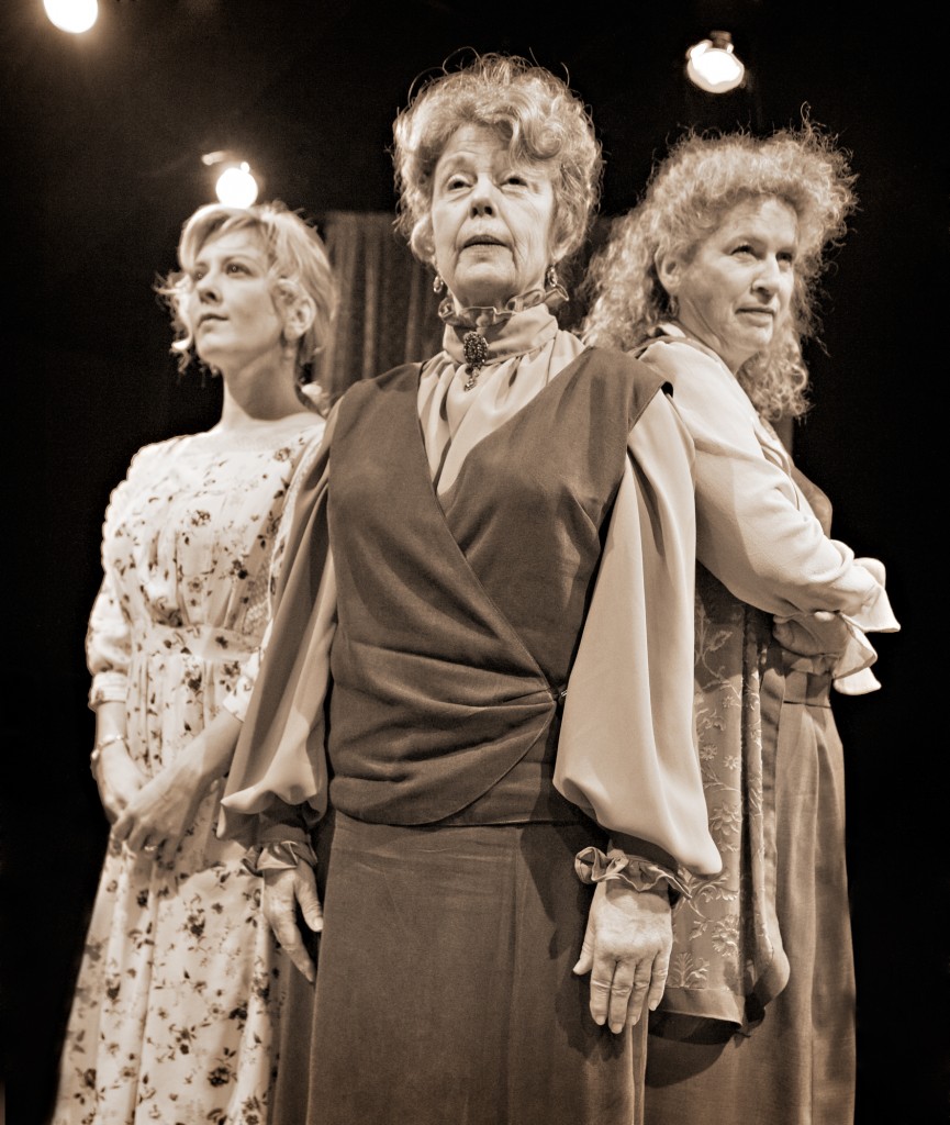
From left: Val Landrum, Jane Fellows and Jacklyn Maddux in "The Carpetbagger's Children" at Profile Theater. Photo: Jamie Bosworth

Here’s a story about the playwright Horton Foote, told by his daughter Daisy Foote and reprinted in the program for Profile Theatre‘s new production of his play The Carpetbagger’s Children, which opened Saturday night:

A few years ago a playwright friend and I were having dinner with my father. My friend had just seen “The Carpetbagger’s Children” at Lincoln Center Theater, and he casually asked my dad how long it took him to write the play. My father, even more casually, answered that it took him all of ten days. At that point, my friend looked like he might throw up all over the table and I might start crying, so my father took pity on us and added, “But I had been thinking about it for a very long time.”

Well, of course.

Stories take time — a lifetime, sometimes — and the actual setting down of them can be simply the culmination of a very long process, the plucking of the fruit from a tree that took years to mature and finally produce. It’s a little like the oft-told story of the “overnight success” that took twenty years to achieve.

But in Foote’s case (he died last March, 10 days shy of his 93rd birthday) it’s not just a matter of long experience bringing forth a story. It’s a matter of long experience in learning how flexible the theater can be, too. The Carpetbagger’s Children, for all its apparent traditionalism, breaks all sorts of rules about the stage — and it breaks them exceptionally because it’s learned the exceptions to the rules.

This is a memory play, and it’s told by three actresses, and “told” is the correct word: They take turns delivering long, carefully wrought soliloquies, speeches that overlap in theme and content (told by each sister from a slightly different point of view) but never overlapping in delivery. There is no dialogue, no pretension of ordinary conversational speech patterns, no give and take, except in the incidental clashes in the way the stories are told.

How could something so “undramatic” be so gripping? Because Foote knew story, and he knew the surprising elasticity of the theater, and he trusted that good performers would know how to bring life into the words that he put down. Remember, this is the guy who wrote the screenplays for To Kill a Mockingbird and Tender Mercies. Not ordinary tales. But that’s the beauty of the things.

I once commented in exasperation that watching a Horton Foote play was like watching paint dry. I don’t think I ever actually wrote those words for print, which is a good thing. I don’t even remember what particular incident inspired them. It must have been, I can only hope, a particularly ham-fisted production of one of his plays. Because although nothing much “happens” in a Foote play, at least in the sense of slam-bang Hollywood action, worlds turn, as they do in Chekhov.

The director of Profile’s production, Jon Kretzu, has a longtime affinity for Chekhov, and it shows in the way these three able actresses turn softly (and sometimes harshly) on a dime. If the journeys they take are largely internal, they have external effects. This is the story, in a way, of a Southern empire crumbling, more quietly than the crumbling empire of Tennessee Williams’ Cat on a Hot Tin Roof (which opens in revival later this month at the Oregon Shakespeare Festival) but crumbling nonetheless. And that’s a fascinating, troubling, sometimes even exciting thing to see.

Briefly: A young Union soldier, fighting against the Confederates in Texas during the Civil War, likes what he sees and comes back, after the war, as a reconstructionist. Through shrewd business dealings and the aid of the triumphant Republican apparatus, he amasses a fortune in money and land, which he considers his offsprings’ duty to hold together. It’s up to sisters Cornelia (Jane Fellows), Grace Anne (Jacklyn Maddux) and Sissie (Val Landrum) to achieve that as the decades roll on.

Well, they can’t. Surprised? But the effort shapes each, and several other characters alluded to, in intense and often warping ways. That’s the way of the world. And without going into more detail, the plain old brutal way of the world is what the play’s about.

With Tim Stapleton’s simple but familiarly domestic in-the-round setting and DeeDee Remington’s spot-on costumes, it’s a handsome production. The three stars settle with warm fury into their characters. Nothing much “happens” except life and death themselves.  And paint does not dry.

*

PICTURED: Val Landrum (left), Jane Fellows (center) and Jacklyn Maddux: the carpetbagger’s daughters. Photo: Jamie Bosworth